
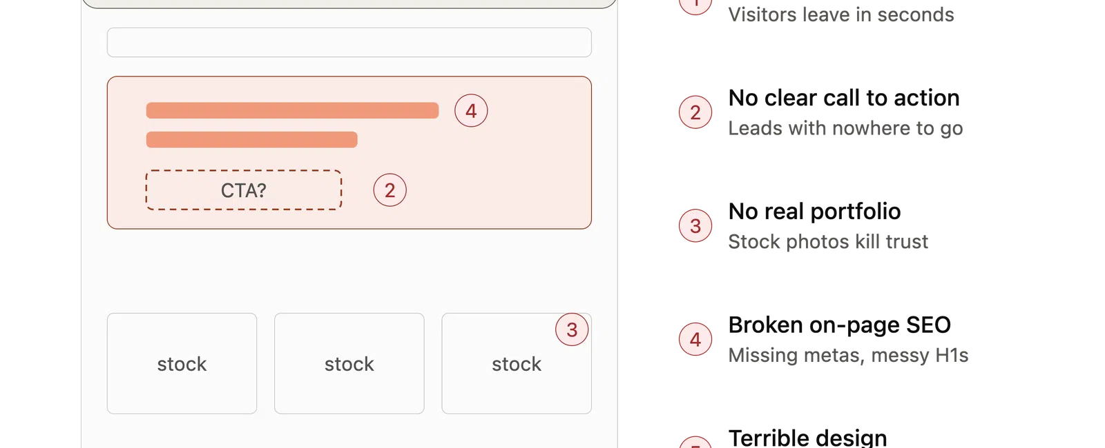
You can be the best builder in your market and still lose jobs to a mediocre competitor with a better website. It happens every day. A homeowner searches, lands on your site, waits four seconds for it to load, sees a wall of stock photos, and hits the back button. That lead just called someone else.
The good news: most contractor websites make the same five mistakes. Fix these and you are ahead of 90% of your competition.
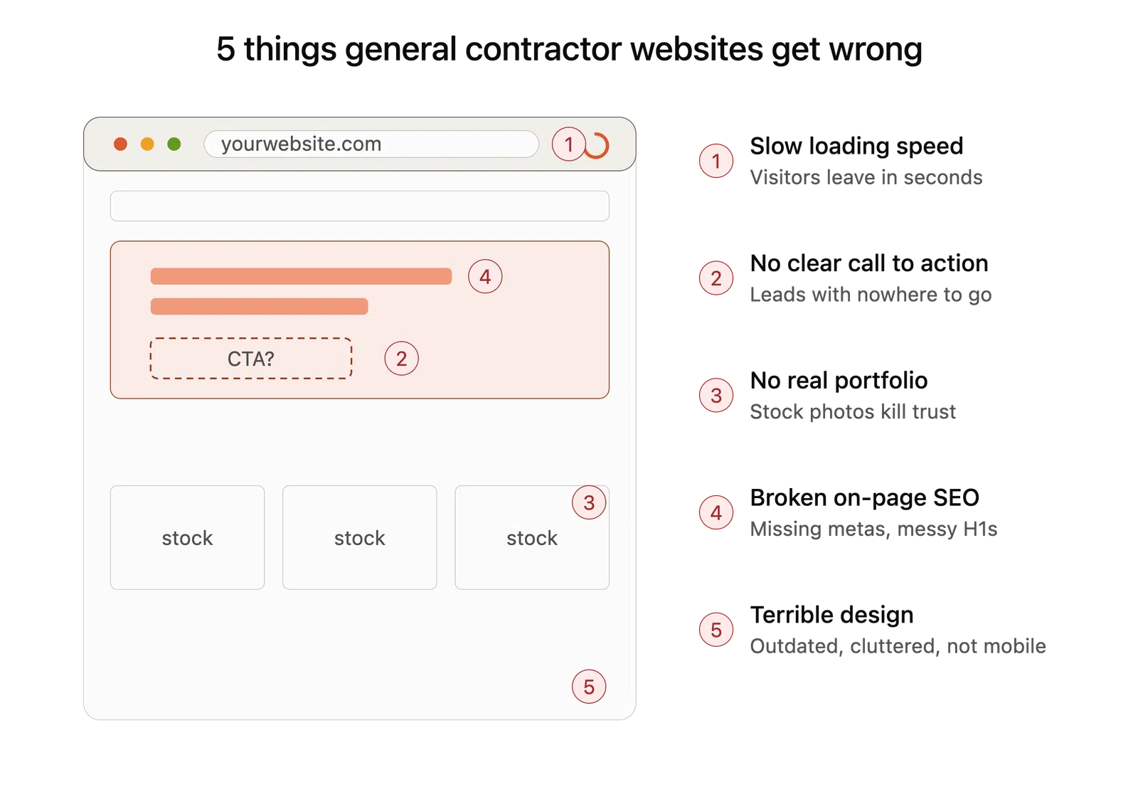
1. Slow Loading Speed
Speed is the first impression before your first impression. If your site takes more than three seconds to load on a phone, a huge chunk of visitors leave before they ever see your work. Google notices too. Page speed is a ranking factor, which means a slow site gets buried under faster competitors before a homeowner even has the chance to bounce off it.
The usual culprits are massive uncompressed photos, bloated page builders, and cheap hosting. Contractors love uploading full-resolution jobsite photos straight from a phone, and a single 8MB image can wreck a page.
The fix: Compress every image before it goes live, use quality hosting, and test your site on Google PageSpeed Insights. If you are scoring in the red on mobile, this is priority one.
2. No Clear Call-to-Action
A homeowner lands on your site ready to talk. What do you want them to do? If the answer is "scroll around and figure it out," you are losing leads.
Too many contractor sites bury the phone number in the footer, hide the contact form three clicks deep, or offer no direction at all. Your website has one job: turn a visitor into a phone call or a form submission. Every page should make that next step obvious.
The fix: Put a prominent "Request a Quote" or "Call Now" button in the header, visible on every page. Repeat it after your services section and again at the bottom. On mobile, make the phone number tap-to-call. Do not make people hunt.
3. No Portfolio (or Worse, Stock Images)
Hiring a contractor is a trust decision, often the biggest one a homeowner makes all year. They want proof you can deliver, and nothing kills trust faster than a "kitchen remodel" photo that also appears on 400 other contractor websites.
Homeowners can spot stock photography instantly. Perfect lighting, staged furniture, a model in a hard hat pointing at blueprints. It reads as fake because it is fake, and it quietly tells visitors you have nothing real to show.
The fix: Build a real portfolio with your actual work. Before-and-after shots are the strongest asset a contractor has. Add a sentence or two of context: the location, the scope, the challenge you solved. Even ten genuine projects with honest photos will outperform a hundred polished stock images.
4. Broken On-Page SEO: Missing Meta Titles, Descriptions, and H1 Problems
This one is invisible to most contractors, which is exactly why it costs them so much.
Your meta title and description are what show up in Google search results. They are your ad in the search listings. When they are missing, Google guesses, and Google guesses badly. "Home" or "Untitled Page" is not going to earn a click over "Kitchen Remodeling in Marietta, GA | Free Estimates."
Then there is the H1 problem. Every page should have exactly one H1 tag that tells Google and visitors what the page is about. Many contractor sites have none. Others have five, because a web builder styled every big text block as an H1. Both confuse search engines about what the page is trying to rank for.
The fix: Every page gets a unique meta title with your service and city, a meta description written to earn the click, and a single H1 that matches what people are searching for. This is basic hygiene, and most of your competitors have not done it.
5. Terrible Design
Fair or not, homeowners judge your craftsmanship by your website. A cluttered, outdated site from 2012 with tiny text, clashing colors, and a layout that breaks on phones tells visitors your business might be run the same way.
You do not need anything flashy. You need clean, professional, and mobile-friendly, because well over half of your traffic is coming from a phone. If a visitor has to pinch and zoom to read your services, they are gone.
The fix: Simple layout, plenty of white space, readable text, real photos, and a design that works flawlessly on mobile. When in doubt, cut. A simple site that loads fast and reads clearly beats a busy one every time.
The Bottom Line
None of these problems require a six-figure rebuild. They require someone who treats your website like a lead generation tool instead of a digital brochure.
At RedBrick, that is the whole point. No long-term contracts, you own every asset we build, and we measure success in qualified leads, not vanity metrics. If your website is guilty of any of the five mistakes above, let's fix it.
Ready to see what your site is costing you? Request a free website audit today.


